I welcome your thoughts on this post, but please read through to the end before commenting. Also, you’ll find the related code (in R) at the end. For those new to this blog, you may be taken aback (though hopefully not bored or shocked!) by how I expose my full process and reasoning. This is intentional and, I strongly believe, much more honest than presenting results without reference to how many different approaches were taken, or how many models were fit, before everything got tidied up into one neat, definitive finding.
Fast summaries
TL;DR (scientific version): Based solely on year-over-year changes in surface temperatures, the net increase since 1881 is fully explainable as a non-independent random walk with no trend.
TL;DR (simple version): Statistician does a test, fails to find evidence of global warming.
Introduction and definitions
As so often happens to terms which have entered the political debate, “global warming” has become infused with additional meanings and implications that go well beyond the literal statement: “the earth is getting warmer.” Anytime someone begins a discussion of global warming (henceforth GW) without a precise definition of what they mean, you should assume their thinking is muddled or their goal is to bamboozle. Here’s my own breakdown of GW into nine related claims:
- The earth has been getting warmer.
- This warming is part of a long term (secular) trend.
- Warming will be extreme enough to radically change the earth’s environment.
- The changes will be, on balance, highly negative.
- The most significant cause of this change is carbon emissions from human beings.
- Human beings have the ability to significantly reverse this trend.
- Massive, multilateral cuts to emissions are a realistic possibility.
- Such massive cuts are unlikely to cause unintended consequences more severe than the warming itself.
- Emissions cuts are better than alternative strategies, including technological fixes (i.e. iron fertilization), or waiting until scientific advances make better technological fixes likely.
Note that not all proponents of GW believe all nine of these assertions.
The data and the test (for GW1)
The only claims I’m going to evaluate are GW1 and GW2. For data, I’m using surface temperature information from NASA. I’m only considering the yearly average temperature, computed by finding the average of four seasons as listed in the data. The first full year of (seasonal) data is 1881, the last year is 2011 (for this data, years begin in December and end in November).
According to NASA’s data, in 1881 the average yearly surface temperature was 13.76°C. Last year the same average was 14.52°C, or 0.76°C higher (standard deviation on the yearly changes is 0.11°C). None of the most recent ten years have been colder than any of the first ten years. Taking the data at face value (i.e. ignoring claims that it hasn’t been properly adjusted for urban heat islands or that it has been manipulated), the evidence for GW1 is indisputable: The earth has been getting warmer.
Usually, though, what people mean by GW is more than just GW; they mean GW2 as well, since without GW2 none of the other claims are tenable, and the entire discussion might be reduced to a conversation like this:
“I looked up the temperature record this afternoon, and noticed that the earth is now three quarters of a degree warmer than it was in the time of my great great great grandfather.”
“Why, I do believe you are correct, and wasn’t he the one who assassinated James A. Garfield?”
“No, no, no. He’s the one who forced Sitting Bull to surrender in Saskatchewan.”
Testing GW2
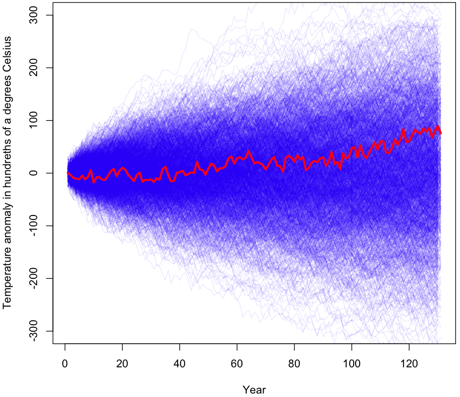
Do the data compel us to view GW as part of a trend and not just background noise? To evaluate this claim, I’ll be taking a standard hypothesis testing approach, starting with the null hypothesis that year-over-year (YoY) temperature changes represent an undirected random walk. Under this hypothesis, the YoY changes are modeled as a independent draws from a distribution with mean zero. The final temperature represents the sum of 130 of these YoY changes. To obtain my sampling distribution, I’ve calculated the 130 YoY changes in the data, then subtracted the mean from each one. This way, I’m left with a distribution with the same variance as in the original data. YoY jumps in temperature will be just as spread apart as before, but with the whole distribution shifted over until its expected value becomes zero. Note that I’m not assuming a theoretical distributional form (eg Normality), all of the data I’m working with is empirical.
My test will be to see if, by sampling 130 times (with replacement!) from this distribution of mean zero, we can nonetheless replicate a net change in global temperatures that’s just as extreme as the one in the original data. Specifically, our p-value will be the fraction of times our Monte Carlo simulation yields a temperature change of greater than 0.76°C or less than -0.76°C. Note that mathematically, this is the same test as drawing from the original data, unaltered, then checking how often the sum of changes resulted in a net temperature change of less than 0 or more than 1.52°C.
I have not set a “critical” p-value in advance for rejecting the null hypothesis, as I find this approach to be severely limiting and just as damaging to science as J-Lo is to film. Instead, I’ll comment on the implied strength of the evidence in qualitative terms.
Initial results
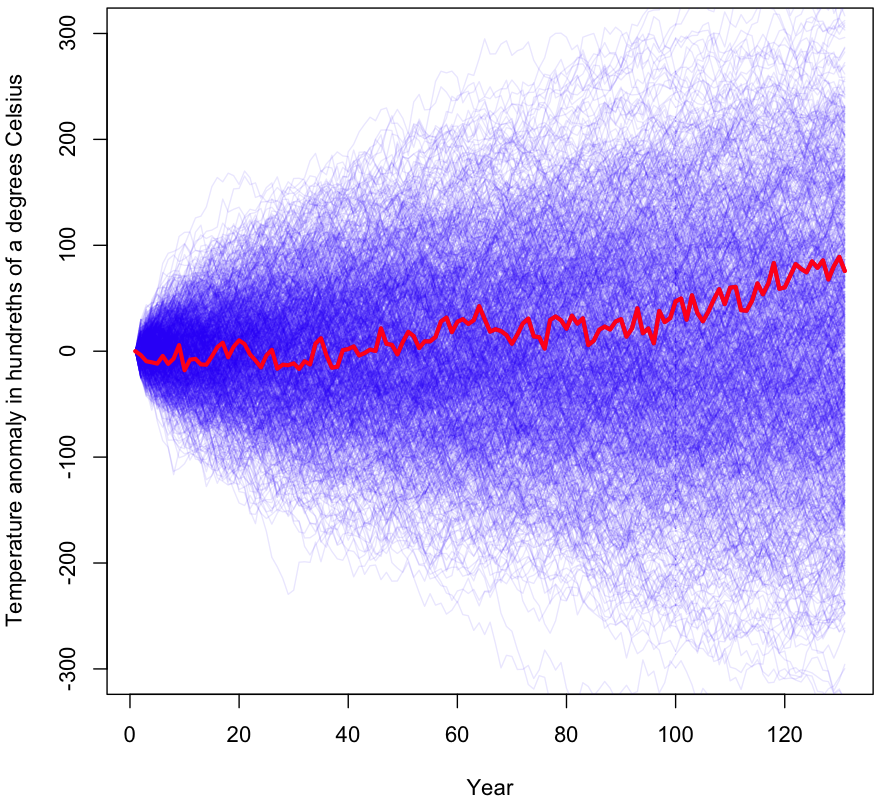
The initial results are shown graphically at the beginning of this post (I’ll wait while you scroll back up). As you can see, a large percentage of the samples gave a more extreme temperature change than what was actually observed (shown in red). During the 1000 trials visualized, 56% of the time the results were more extreme than the original data after 130 years worth of changes. I ran the simulation again with millions of trials (turn off plotting if you’re going to try this!); the true p-value for this experiment is approximately 0.55.
For those unfamiliar with how p-values work, this means that, assuming temperature changes are randomly plucked out of a bundle of numbers centered at zero (ie no trend exists), we would still see equally dramatic changes in temperature 55% of the time. Under even the most generous interpretation of the p-value, we have no reason to reject the null hypothesis. In other words, this test finds zero evidence of a global warming trend.
Testing assumptions Part 1
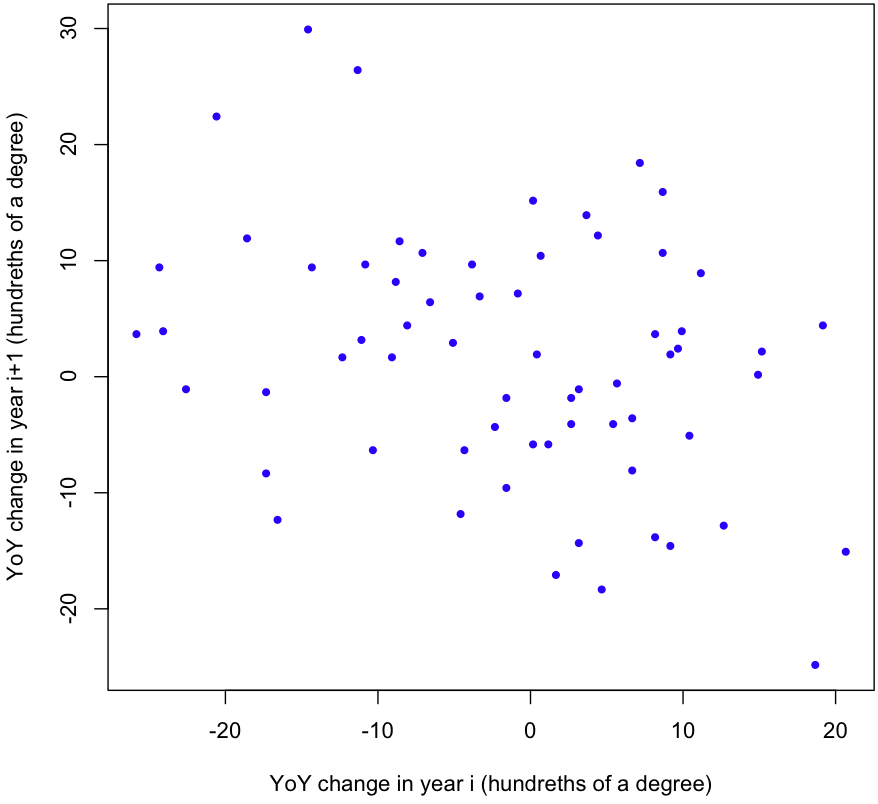
But wait! We still haven’t tested our assumptions. First, are the YoY changes independent? Here’s a scatterplot showing the change in temperature one year versus the change in temperature the next year:
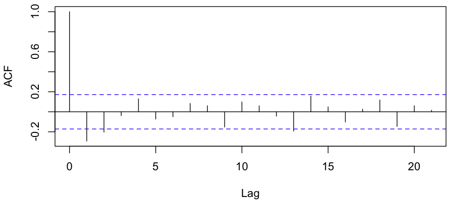
Looks like there’s a negative correlation. A quick linear regression gives a p-value of 0.00846; it’s highly unlikely that the correlation we see (-0.32) is mere chance. One more test worth running is the ACF, or the Autocorrelation function. Here’s the plot R gives us:
Evidence for a negative correlation between consecutive YoY changes is very strong, and there’s some evidence for a negative correlation between YoY changes which are 2 years apart as well.
Before I explain how to incorporate this information into a revised Monte Carlo simulation, what does a negative correlation mean in this context? It tells us that if the earth’s temperature rises by more than average in one year, it’s likely to fall (or rise less than average) the following year, and vice versa. The bigger the jump one way, the larger the jump the other way next year (note this is not a case of regression to the mean; these are changes in temperature, not absolute temperatures. Update: This interpretation depends on your assumptions. Specifically, if you begin by assuming a trend exists, you could see this as regression to the mean. Note, however, that if you start with noise, then draw a moving average, this will induce regression to the mean along your “trendline”). If anything, this is evidence that the earth has some kind of built in balancing mechanism for global temperature changes, but as a non-climatologist all I can say is that the data are compatible with such a mechanism; I have no idea if this makes sense physically.
Correcting for correlation
What effect will factoring in this negative correlation have on our simulation? My initial guess is that it will cause the total temperature change after 130 years to be much smaller than under the pure random walk model, since changes one year are likely to be balanced out by changes next year in the opposite direction. This would, in turn, suggest that the observed 0.76°C change over the past 130 years is much less likely to happen without a trend.
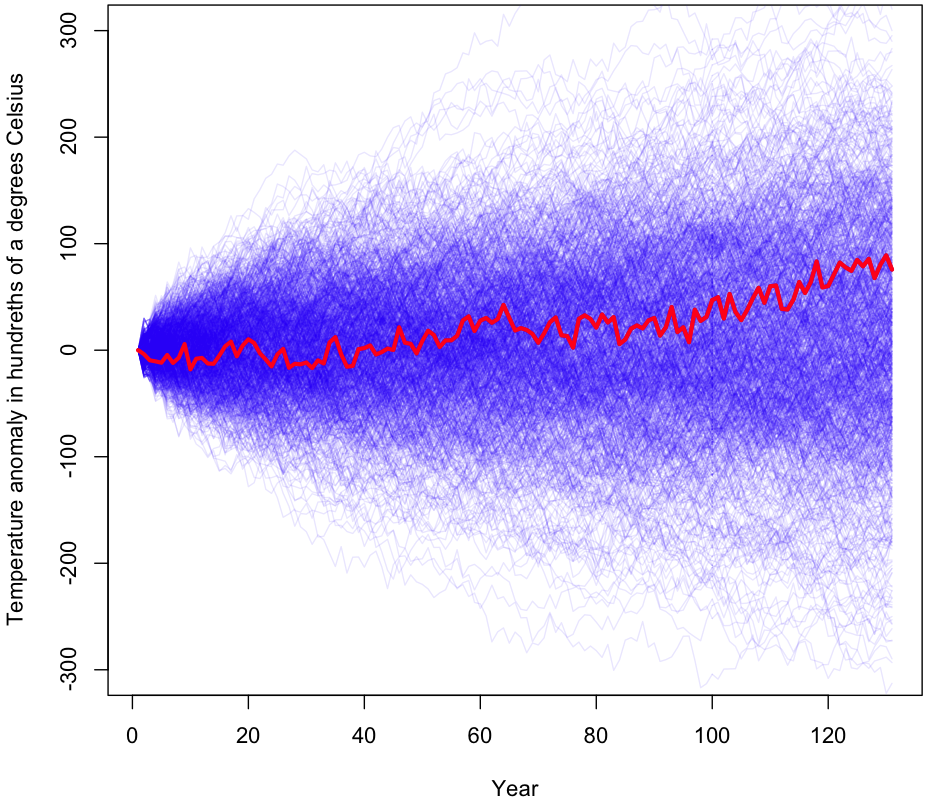
The most straightforward way to incorporate this correlation into our simulation is to sample YoY changes in 2-year increments. Instead of 130 individual changes, we take 65 changes from our set of centered changes, then for each sample we look at that year’s changes and the year that immediately follows it. Here’s what the plot looks like for 1000 trials.
After doing 100,000 trials with 2 year increments, we get a p-value of 0.48. Not much change, and still far from being significant. Sampling 3 years at a time brings our p-value down to 0.39. Note that as we grab longer and longer consecutive chains at once, the p-value has to approach 0 (asymptotically) because we are more and more likely to end up with the original 130 year sequence of (centered) changes, or a sequence which is very similar. For example, increasing our chain from one YoY change to three reduces the number of samplings from 130130 to approximately 4343 – still a huge number, but many orders of magnitude less (Fun problem: calculate exactly how many fewer orders of magnitude. Hint: If it takes you more than a few minutes, you’re doing it wrong).
Correcting for correlation Part 2 (A better way?)
To be more certain of the results, I ran the simulation in a second way. First I sampled 130 of the changes at random, then I threw out any samplings where the correlation coefficient was greater than -0.32. This left me with the subset of random samplings whose coefficients were less than -0.32. I then tested these samplings to see the fraction that gave results as extreme as our original data.
Compared to the chained approach above, I consider this to be a more “honest” way to sample an empirical distribution, given the constraint of a (maximum) correlation threshold. I base this on E.T. Jaynes’ demonstration that, in the face of ignorance as to how a particular statistic was generated, the best approach is to maximize the (informational) entropy. The resulting solution is the most likely result you would get if you sampled from the full space (uniformly), then limited your results to those which match your criteria. Intuitively, this approach says: Of all the ways to arrive at a correlation of -0.32 or less, which are the most likely to occur?
For a more thorough discussion of maximum entropy approaches, see Chapter 11 of Jaynes’ book “Probability Theory” or his “Papers on Probability” (1979). Note that this is complicated, mind-blowing stuff (it was for me, anyway). I strongly recommend taking the time to understand it, but don’t bother unless you have at least an intermediate-level understanding of math and probability.
Here’s what the plot looks like subject to the correlation constraint:
If it looks similar to the other plots in terms of results, that’s because it is. Empirical p-value from 1000 trials? 0.55. Because generating samples with the required correlation coefficients took so long, these were the only trials I performed. However, the results after 1000 trials are very similar to those for 100,000 or a million trials, and with a p-value this high there’s no realistic chance of getting a statistically significant result with more trials (though feel free to try for yourself using the R code and your cluster of computers running Hadoop). In sum, the maximum entropy approach, just like the naive random walk simulation and the consecutive-year simulations, gives us no reason to doubt our default explanation of GW2 – that it is the result of random, undirected changes over time.
One more assumption to test
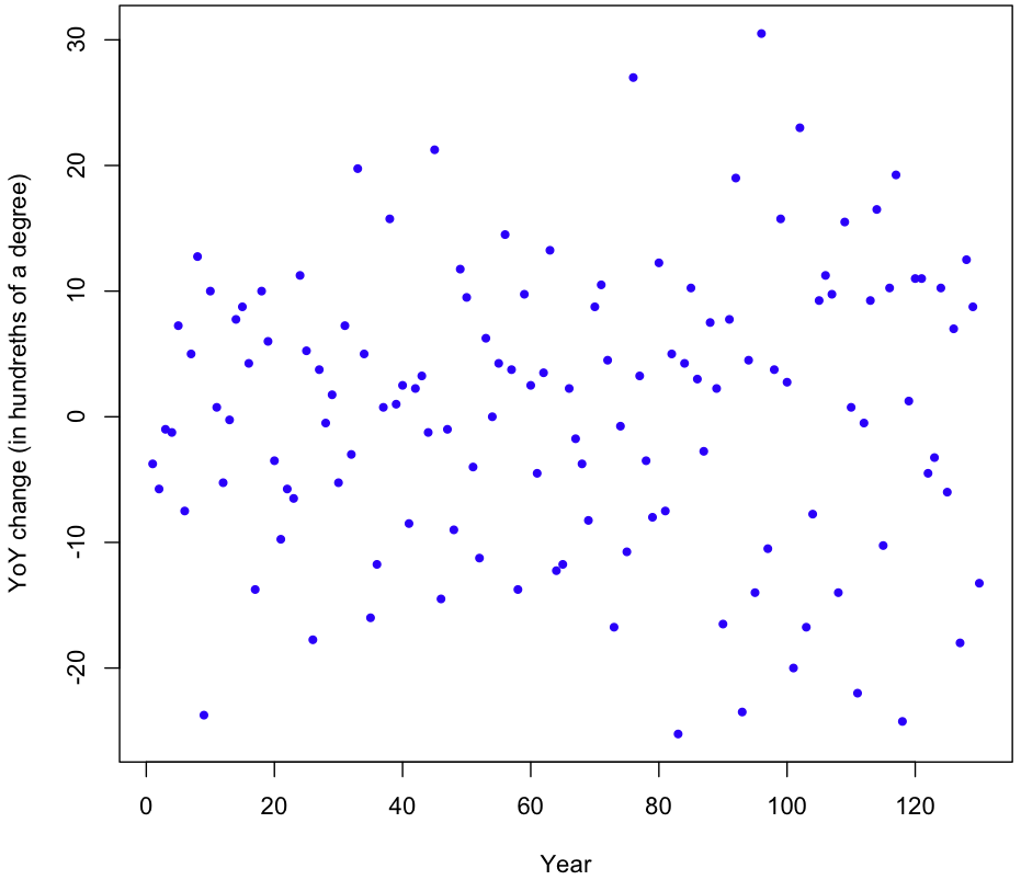
Another assumption in our model is that that YoY changes have constant variance over time (homoscedasticity). Here’s the plot of the (raw, uncentered) YoY changes:
It appears that the variance might be increasing over time, but just looking at the plot isn’t conclusive. To be sure, I took the absolute value of the changes and ran a simple regression on them. The result? Variance is increasing (p-value 0.00267), though at a rate that’s barely perceptible; the estimated absolute increase in magnitude of the YoY changes is 0.046. That figure is in hundreths of degrees Celsius, so our linear model gives a rate of increase in variability of just 4.6 ten-thousands of a degree per year. Over the course of 130 years, that equates to an increase of six hundredths of a degree Celsius (margin of error of 3.9 hundredths at two std deviations). This strikes me as a miniscule amount, though relative to the size of the YoY changes themselves it’s non-trivial.
Does this increase in volatility invalidate our simulation? I don’t think so. Any model which took into account this increase in volatility (while still being centered) would be more likely to produce extreme results under the null hypothesis of undirected change. In other words, the bigger the yearly temperature changes, the more likely a random sampling of those changes will lead us far away from our 13.8°C starting point in 1881, with most of the variation coming towards the end. If we look at the data, this is exactly what happens. During the first 63 years of data the temperature increases by 42 hundredths of a degree, then drops 40 hundredths in just 12 years, then rises 80 hundredths within 25 years of that; the temperature roller coaster is becoming more extreme over time, as variability increases.
Beyond falsifiability
Philosopher Karl Popper insisted that for a theory to be scientific, it must be falsifiabile. That is, there must exist the possibility of evidence to refute the theory, if the theory is incorrect. But falsifiability, by itself, is too low a bar for a theory to gain acceptance. Popper argued that there were gradations and that “the amount of empirical information conveyed by a theory, or it’s empirical content, increases with its degree of falsifiability” (emphasis in original).
Put in my words, the easier it is to disprove a theory, the more valuable the theory. (Incorrect) theories are easy to disprove if they give narrow prediction bands, are testable in a reasonable amount of time using current technology and measurement tools, and if they predict something novel or unexpected (given our existing theories).
Perhaps you have already begun to evaluate the GW claims in terms of these criteria. I won’t do a full assay of how the GW theories measure up, but I will note that we’ve had several long periods (10 years or more) with no increase in global temperatures, so any theory of GW3 or GW5 will have to be broad enough to encompass decades of non-warming, which in turn makes the theory much harder to disprove. We are in one of those sideways periods right now. That may be ending, but if it doesn’t, how many more years of non-warming would we need for scientists to abandon the theory?
I should point out that a poor or a weak theory isn’t the same as an incorrect theory. It’s conceivable that the earth is in a long-term warming trend (GW2) and that this warming has a man-made component (GW5), but that this will be a slow process with plenty of backsliding, visible only over hundreds or thousands of years. The problem we face is that GW3 and beyond are extreme claims, often made to bolster support for extreme changes in how we live. Does it make sense to base extreme claims on difficult to falsify theories backed up by evidence as weak as the global temperature data?
Invoking Pascal’s Wager
Many of the arguments in favor of radical changes to how we live go like this: Even if the case for extreme man-made temperature change is weak, the consequences could be catastrophic. Therefore, it’s worth spending a huge amount of money to head off a potential disaster. In this form, the argument reminds me of Pascal’s Wager, named after Blaise Pascal, a 17th century mathematician and co-founder of modern probability theory. Pascal argued that you should “wager” in favor of the existance of God and live life accordingly: If you are right, the outcome is infinitely good, whereas if you are wrong and there is no God, the most you will have lost is a lifetime of pleasure.
Before writing this post, I Googled to see if others had made this same connection. I found many discussions of the similarities, including this excellent article by Jim Manzi at The American Scene. Manzi points out problems with applying Pascal’s Wager, including the difficulty in defining a stopping point for spending resources to prevent the event. If a 20°C increase in temperature is possible, and given that such an increase would be devastating to billions of people, then we should be willing to spend a nearly unlimited amount to avert even a tiny chance of such an increase. The math works like this: Amount we should be willing to spend = probability of 20°C increase (say 0.00001) * harm such an increase would do (a godzilla dollars). The end result is bigger than the GDP of the planet.
Of course, catastrophic GW isn’t the only potential threat can have Pascal’s Wager applied to it. We also face annihilation from asteroids, nuclear war, and new diseases. Which of these holds the trump card to claim all of our resources? Obviously we need some other approach besides throwing all our money at the problem with the scariest Black Swan potential.
There’s another problem with using Pascal’s Wager style arguments, one I rarely see discussed: proponents fail to consider the possibility that, in radically altering how we live, we might invite some other Black Swan to the table. In his original argument, Pascal the Jansenist (sub-sect of Christianity) doesn’t take into account the possibility that God is a Muslim and would be more upset by Pascal’s professed Christianity than He would be with someone who led a secular lifestyle. Note that these two probabilities – that God is Muslim who hates Christians more than atheists, or that God is Christian and hates atheists – are incommesurable! There’s no rational way to weigh them and pick the safer bet.
What possible Black Swans do we invite by forcing people to live at the same per-capita energy-consumption level as our forefathers in the time of James A. Garfield?
Before moving on, I should make clear that humans should, in general, be very wary of inviting Black Swans to visit. This goes for all experimentation we do at the sub-atomic level, including work done at the LHC (sorry!), and for our attempts to contact aliens (as Stephen Hawking has pointed out, there’s no certainty that the creatures we attract will have our best interests in mind). So, unless we can point to strong, clear, tangible benefits from these activities, they should be stopped immediately.
Beware the anthropic principle
Strictly speaking, the anthropic principle states that no matter how low the odds are that any given planet will house complex organisms, one can’t conclude that the existence of life on our planet is a miracle. Essentially, if we didn’t exist, we wouldn’t be around to “notice” the lack of life. The chance that we should happen to live on a planet with complex organisms is 1, because it has to be.
More broadly, the anthropic principle is related to our tendency to notice extreme results, then assume these extremes must indicate something more than the noise inherent in random variation. For example, if we gathered together 1000 monkeys to predict coin tosses, it’s likely that one of them will predict the first 10 flips correctly. Is this one a genius, a psychic, an uber-monkey? No. We just noticed that one monkey because its record stood out.
Here’s another, potentially lucrative, most likely illegal, definitely immoral use of the anthropic principle. Send out a million email messages. In half of them, predict that a particular stock will go up the next day, in the other half predict it will go down. The next day, send another round of predictions to just those emails that got the correct prediction the first time. Continue sending predictions to only those recipients who receive the correct guesses. After a dozen days, you’ll have a list of people who’ve seen you make 12 straight correct predictions. Tell these people to buy a stock you want to pump and dump. Chances are good they’ll bite, since from their perspective you look like a stock-picking genius.
What does this have to do with GW? It means that we have to disentangle our natural tendency to latch on to apparent patterns from the possibility that this particular pattern is real, and not just an artifact of our bias towards noticing unlikely events under null hypotheses.
Biases, ignorance, and the brief life, death, and afterlife of a pet theory
While the increase in volatility seen in the temperature data complicates our analysis of the data, it gives me hope for a pet theory about climate change which I’d buried last year (where does one bury a pet theory?). The theory (for which I share credit with my wife and several glasses of wine) is that the true change in our climate should best be described as Distributed Season Shifting, or DSS. In short, DSS states that we are now more likely to have unseasonably warm days during the colder months, and unseasonably cold days during the warmer months. Our seasons are shifting, but in a chaotic, distributed way. We built this theory after noticing a “weirdening” of our weather here in Toronto. Unfortunately (for the theory), no matter how badly I tortured the local temperature data, I couldn’t get it to confess to DSS.
However, maybe I was looking at too small a sample of data. The observed increase in volatility of global YoY changes might also be reflected in higher volatility within the year, but the effects may be so small that no single town’s data is enough to overcome the high level of “normal” volatility within seasonal weather patterns.
My tendency to look for confirmation of DSS in weather data is a bias. Do I have any other biases when it comes to GW? If anything, as the owner of a recreational property located north of our northern city, I have a vested interest in a warmer earth. Both personally (hotter weather = more swimming) and financially, GW2 and 3 would be beneficial. In a Machiavellian sense, this might give me an incentive to downplay GW2 and beyond, with the hope that our failure to act now will make GW3 inevitable. On the other hand, I also have an incentive to increase the perception of GW2, since I will someday be selling my place to a buyer who will base her bid on how many months of summer fun she expects to have in years to come.
Whatever impact my property ownership and failed theory have on this data analysis, I am blissfully free of one biasing factor shared by all working climatologists: the pressures to conform to peer consensus. Don’t underestimate the power of this force! It effects everything from what gets published to who gets tenure. While in the long run scientific evidence wins out, the short run isn’t always so short: For several decades the medical establishment pushed the health benefits of a low fat, high carb diet. Alternative views are only now getting attention, despite hundreds of millions of dollars spent on research which failed to back up the consensus claims.
Is the overall evidence for GW2 – 9 as weak as the evidence used to promote high carb diets? I have no idea. Beyond the global data I’m examining here, and my failed attempt to “discover” DSS in Toronto’s temperature data, I’m coming from a position of nearly complete ignorance: I haven’t read the journal articles, I don’t understand the chemistry, and I’ve never seen Al Gore’s movie.
Final analysis and caveats
Chances are, if you already had strong opinions about the nine faces of GW before reading this article, you won’t have changed your opinion much. In particular, if a deep understanding of the science has convinced you that GW is a long term, man-made trend, you can point out that I haven’t disproven your view. You could also argue the limitations of testing the data using the data, though I find this more defensible than testing the data with a model created to fit the data.
Regardless of your prior thinking, I hope you recognize that my analysis shows that YoY temperature data, by itself, provides no evidence for GW2 and beyond. Also, because of the relatively long periods of non-warming within the context of an overall rise in global temperature, any correct theory of GW must include backsliding within it’s confidence intervals for predictions, making it a weaker theory.
What did my analysis show for sure? Clearly, temperatures have risen since the 1880s. Also, volatility in temperature changes has increased. That, of itself, has huge implications for our lives, and tempts me to do more research on DSS (what do you call pet theory that’s risen from the dead?). I’ve also become intrigued with the idea that our climate (at large) has mechanisms to balance out changes in temperature. In terms of GW2 itself, my analysis has not convinced me that it’s all a myth. If we label random variation “noise” and call trend a “signal,” I’ve shown that yearly temperature changes are compatible with an explanation of pure noise. I haven’t shown that no signal exists.
Thanks for reading all the way through! Here’s the code:
Code in R
theData = read.table("/path/to/theData/FromNASA/cleanedForR.txt", header=T)

# There has to be a more elegant way to do this
theData$means = rowMeans(aggregate(theData[,c("DJF","MAM","JJA","SON")], by=list(theData$Year), FUN="mean")[,2:5])

# Get a single vector of Year over Year changes
rawChanges = diff(theData$means, 1)

# SD on yearly changes
sd(rawChanges)

# Subtract off the mean, so that the distribution now has an expectaion of zero
changes = rawChanges - mean(rawChanges)

# Find the total range, 1881 to 2011
(theData$means[131] - theData$means[1])/100

# Year 1 average, year 131 average, difference between them in hundreths
y1a = theData$means[1]/100 + 14
y131a = theData$means[131]/100 + 14
netChange = (y131a - y1a)*100

# First simulation, with plotting
plot.ts(cumsum(c(0,rawChanges)), col="red", ylim=c(-300,300), lwd=3, xlab="Year", ylab="Temperature anomaly in hundreths of a degrees Celsius")

trials = 1000
finalResults = rep(0,trials)

for(i in 1:trials) {
	jumps = sample(changes, 130, replace=T)

	# Add lines to plot for this, note the "alpha" term for transparency
	lines(cumsum(c(0,jumps)), col=rgb(0, 0, 1, alpha = .1))

	finalResults[i] = sum(jumps)

}

# Re-plot red line again on top, so it's visible again
lines(cumsum(c(0,rawChanges)), col="red", ylim=c(-300,300), lwd=3)

# Fnd the fraction of trials that were more extreme than the original data
( length(finalResults[finalResults>netChange]) + length(finalResults[finalResults<(-netChange)]) ) / trials # Many more simulations, minus plotting trials = 10^6 finalResults = rep(0,trials) for(i in 1:trials) { 	jumps = sample(changes, 130, replace=T) 	 	finalResults[i] = sum(jumps) } # Fnd the fraction of trials that were more extreme than the original data ( length(finalResults[finalResults>netChange]) + length(finalResults[finalResults<(-netChange)]) ) / trials # Looking at the correlation between YoY changes x = changes[seq(1,129,2)] y = changes[seq(2,130,2)] plot(x,y,col="blue", pch=20, xlab="YoY change in year i (hundreths of a degree)", ylab="YoY change in year i+1 (hundreths of a degree)") summary(lm(x~y)) cor(x,y) acf(changes) # Try sampling in 2-year increments plot.ts(cumsum(c(0,rawChanges)), col="red", ylim=c(-300,300), lwd=3, xlab="Year", ylab="Temperature anomaly in hundreths of a degrees Celsius") trials = 1000 finalResults = rep(0,trials) for(i in 1:trials) { 	indexes = sample(1:129,65,replace=T) 	 	# Interlace consecutive years, to maintian the order of the jumps  	jumps = as.vector(rbind(changes[indexes],changes[(indexes+1)])) 	 	lines(cumsum(c(0,jumps)), col=rgb(0, 0, 1, alpha = .1)) 	 	finalResults[i] = sum(jumps) } # Re-plot red line again on top, so it's visible again lines(cumsum(c(0,rawChanges)), col="red", ylim=c(-300,300), lwd=3)  # Find the fraction of trials that were more extreme than the original data ( length(finalResults[finalResults>netChange]) + length(finalResults[finalResults<(-netChange)]) ) / trials # Try sampling in 3-year increments trials = 100000 finalResults = rep(0,trials) for(i in 1:trials) { 	indexes = sample(1:128,43,replace=T) 	 	# Interlace consecutive years, to maintian the order of the jumps  	jumps = as.vector(rbind(changes[indexes],changes[(indexes+1)],changes[(indexes+2)])) 	 	# Grab one final YoY change to fill out the 130 	jumps = c(jumps, sample(changes, 1)) 	 	finalResults[i] = sum(jumps) } # Fnd the fraction of trials that were more extreme than the original data ( length(finalResults[finalResults>netChange]) + length(finalResults[finalResults<(-netChange)]) ) / trials # The maxEnt method for conditional sampling lines(cumsum(c(0,rawChanges)), col="red", ylim=c(-300,300), lwd=3)  trials = 1000 finalResults = rep(0,trials) for(i in 1:trials) { 	theCor = 0 	while(theCor > -.32) {
		jumps = sample(changes, 130, replace=T)
		theCor = cor(jumps[1:129],jumps[2:130])
	}

	# Add lines to plot for this
	lines(cumsum(jumps), col=rgb(0, 0, 1, alpha = .1))

	finalResults[i] = sum(jumps)

}

# Re-plot red line again on top, so it's visible again
lines(cumsum(c(0,rawChanges)), col="red", ylim=c(-300,300), lwd=3)

( length(finalResults[finalResults>74]) + length(finalResults[finalResults<(-74)]) ) / trials

# Plot of YoY changes over time
plot(rawChanges,pch=20,col="blue", xlab="Year", ylab="YoY change (in hundreths of a degree)")

# Is there a trend?
absRawChanges = abs(rawChanges)
pts = 1:130
summary(lm(absRawChanges~pts))

