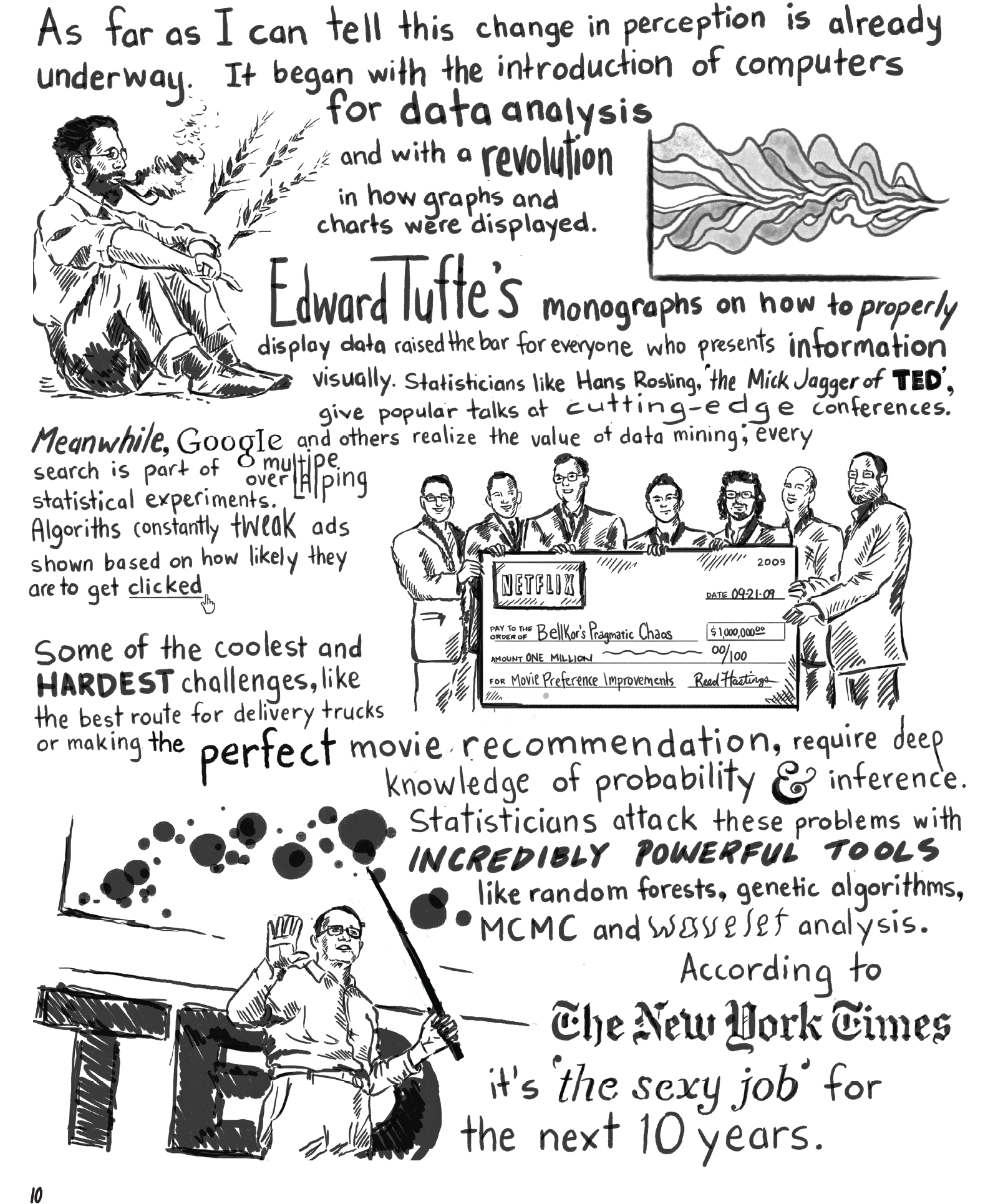
Right now I’m working on a project that involves new ways to view units of content and the relationships between them. I’ve posted the comic I worked on, it has a number of stats references throughout. This is early alpha stages for the software, you may run into issues. To see the relationships, go to the puffball menu and make sure that “Show relationships” is clicked.

-
Recent Posts
Recent Comments
Archives
- December 2022
- October 2020
- November 2018
- May 2016
- March 2016
- October 2015
- September 2015
- February 2015
- December 2014
- September 2014
- June 2014
- May 2014
- April 2014
- March 2014
- February 2014
- January 2014
- December 2013
- November 2013
- October 2013
- September 2013
- August 2013
- July 2013
- May 2013
- April 2013
- March 2013
- February 2013
- January 2013
- December 2012
- October 2012
- June 2012
- May 2012
- February 2012
- January 2012
- December 2011
- November 2011
- October 2011
- June 2011
- May 2011
- February 2011
- January 2011
- December 2010
- November 2010
- September 2010
- August 2010
- July 2010
- June 2010
- May 2010
- April 2010
- March 2010
Categories
Meta
© 2024.

William Cleveland also deserves mention in graphical visualization of quantitative information. 🙂
NZgrapher is also a great site to creating box and whiskers graphs.