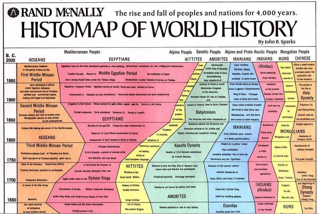
- The Histomap of World History illustrates the rise and fall of various empires and civilizations through an increasing time series up to present day (because the original image is too large, we include a truncated version here in post). Did you know that you can create these visuals in R? Here is how to do them.
- When we deal with time series modelling and forecasting, many people start with sophisticated models like the ARIMA or the GARCH. Rob Hyndman of Monash University suggests that when forecasting daily data, unless the the time series is very long, the easiest approach is to simply set the frequency attribute to 7. Then any of the usual time series forecasting methods should produce reasonable forecasts.
- Kaiser Fung, the owner of the popular statistics blog Junkcharts, interviews Andrew Gelman.
- OpenStreetMap is crowdsourced map project. Thousands of users log in each day, and help to improve the map by updating their neighborhood. Here is a visualization of this amazing social fabric of individuals working together. Every user is assigned different color, and their updates are represented on this map. Take a look at how many people have been mapping near you.
- A series of four articles by Charlie Kufs of statswithcats on How to Write Data Analysis Reports.
- What is the limiting distribution of a sum of weighted Gaussian?
This entry was posted on Monday, September 23rd, 2013 at 12:00 pm and is filed under News.
You can follow any comments to this entry through the RSS 2.0 feed.
Both comments and pings are currently closed.

